This guide will familiarize you with how and when to use Comparison Reports in the Sales section.
Note: First, we recommend that you get caught up on the capabilities of Compare, by reading up on the “Introduction to Sales Reporting.”
1. Configure your Comparison Events
Find this section under Sales>Compare.
1. Decide on what you want to compare
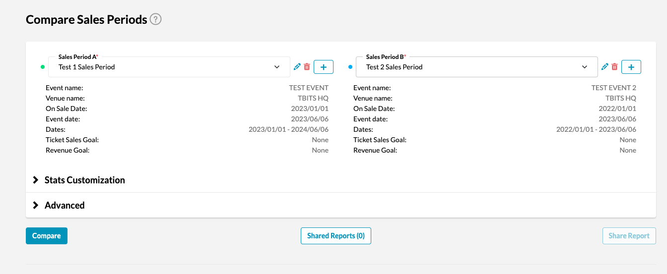
2. Click “+” and configure the parameters of your first comparison, and click save

3. Repeat Steps 1 & 2 for the other entity you’d like to compare
2. Set your Advanced Search Parameters:
Step 1: Choose your Graph Type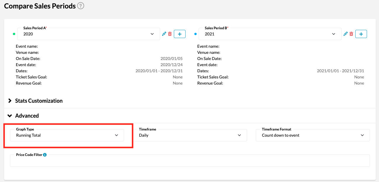
Running Total: Shows your cumulative performance over time as a running total. For example, if you make 40 sales in the first week, and 0 sales in the second week, your graph will show a plateau because it builds week-over-week or day-over-day.

Interval: Shows your performance as peaks and troughs dependent on performance during the interval. For example, if you make 40 sales in the first week, and no sales in the second week, your graph will show a “peak” on week one.
Step 2: Choose Your Time Frame
You can choose to display your data daily or weekly across your set period. The time period is displayed on the x-axis of your graph.
Daily:
Weekly:
Step 3: Select a Sales Target (Optional)
If you want to view a performance comparison by % to target, you will need to input a target number. The sales target you input needs to be in the form of “number of items sold” (i.e. #of tickets, #of seats, #of T-shirts sold) not the dollar value. We will get more into the % view in section 4.
Step 4: Select a Price Code Filter
If you want to look at a specific price code (eg. VIP) you can add the filter here. If you’re not sure what your price codes are labelled, you can view all price codes for your business in Data Cube.
How to view price codes in Data Cube:
Go to Data Cube, select your time period, and then choose “Price Code”, and click “search.” All price codes for this time period will show under the column “Price Code” in your results.
3. Click Compare
Once you’ve set up all your advanced search parameters, click compare and you will see graphs for both selected time periods (one yellow, one green) for:
- Sales
- Ad Spend
- Tracker Clicks
4. Read your Report
1. Performance Comparison Graphs:
Sales: Compare ticket and merchandise sales for the selected periods. For your sales graph, you can change your view to any of the following:
- Sales: will show the number of purchases (e.g. someone who bought 2 tickets at the same time will count for 1)
- Quantity: will show #of items/tickets sold within all purchases (e.g. someone who bought 2 tickets at the same time will count for 2)
- $: Total revenue in CAD
- %: Percentage of the target revenue
- To view this graph, you must set a “sales target” in your advanced search parameters. The graphs will display % of sales target
2. Purchase Demographics:
Purchase Demographics shows how purchase location may vary for the periods you are comparing. For example, it will display that while 25% of your sales were from Vancouver in 2018, only 20% of your sales were from Vancouver in 2019.

3. Breakdown Table
The Breakdown table shows the specific data that makes up the sales graph, details purchases for each period on ‘equivalent days’ and calculates the percent change between periods.
For example, let’s say you’re comparing a promotional period that covers 90 days (between October to December). For each day over this promotional period, you can see purchase results for year 1 and year 2, as well as how they differ.

Please reach out to your Customer Success Manager or contact support@tradablebits.com for further assistance!