To get started, head to Sales>Reporting>Analytics.
To preface the sales analytics report, we know that nothing is more daunting than a blank page. It’s okay, we’re here with you. To get situated before you start MacGyver-ing around, we recommend inputting a time period where you know you have data and just clicking that “search” button.
Then take it all in. As you’ll be able to see, there are 4 main sections of our Analytics report: Results, Geographic Distribution, Correlation Graph and Heat Map.
Note: All four sections are tied to the same parameters of search you set at the top of the page
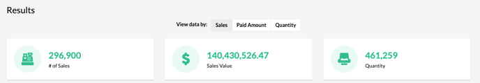
Section 1: Results
Step 1: Set your date, and other inputs (i.e. venue name, artist, price code, province or country) and click that “search” button. If our FanCRM holds data that fits your search parameter(s), the results section will populate.
Step 2: Read your Results. You will be able to view the # of sales, their sales value in CAD, and the quantity of items/tickets purchased. Simple!
Section 2: Geographic Distribution
It’s a map! The geographic distribution section is your way to see - you guessed it - geographic hotspots for purchases. There are two main components, the country map, and a monthly breakdown bar chart.

Read the Country Map: view sales by country & province/state  If you haven’t limited your search parameters to one country or province, you can select from a dropdown list of countries to get a closer look at which parts of the countries currently purchase the most. Your “hottest” countries show up first in the drop-down. Once you select a country, simply hover your mouse over the provinces/states to see the number of tickets sold in each region.
Read the Monthly Breakdown Chart: See sales by month  Use this chart to quickly evaluate which months sell the most tickets. If you want an aggregate view of monthly ticket sales “across the board” leave “country and province” blank in your search parameters.
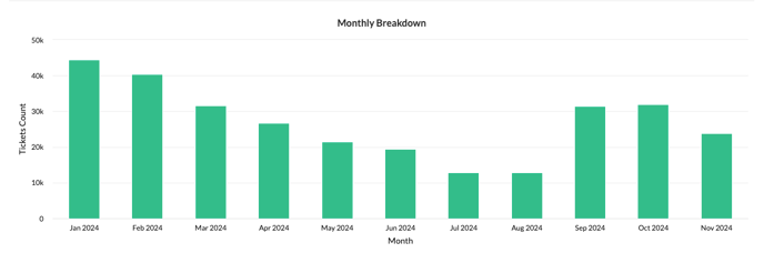
To hone in on a specific country, this is where you’ll need to limit your search parameters. Say that you rifle through your country list, and notice a higher than average ticket count in Australia. To dive into the tickets purchased per month in Australia for that set time period, scroll to the top of the page and enter “Australia” under “country”. Then when you click “search” your monthly breakdown chart will show ticket/purchase amount ONLY for Australia.
Section 3: Correlation Graph
Uncover how your data is interconnected with this correlation graph and “connect the dots”.
Before you get started, make sure that the parameters of your search are not to “zeroed in” on a specific venue or event. You will not be able to pull a correlation graph that includes information outside your filter.
For example, let’s say you’re filtering by venue at the top of the page, and have included “Venue1” in your search parameters. When you go to the correlation graph section and push ‘graph” it’s likely that nothing will show up. Why? Because you’re only looking at data from one venue, and you can’t “correlate” unless you have two or more things to compare.
 To get started:
- Make sure your search parameters are broad enough
- Select the field (event name, artist name, venue name, or venue provice) that you want to analyze
- If you want to see the connections for a specific entity, enter it into the “center around” search field. If you want to see how everything is related, leave the field blank and don;t center around anything.
- Click Graph and watch the magic happen.
To read your correlation graph:
This graph shows you the network of your selected entity. Each node represents one thing (i.e. if you view by artist name, each node will represent a unique artist). The lines between nodes represent correlations. The thicker the line, the more connections the two nodes share.
- Use your mouse to scroll, and zoom in and out.
- Hone in on specific artists, events, venues or provinces by clicking on their nodes. You will get a list of their highest connections, ordered from most to least.
Note: The number of connections comes from a normalizing algorithm that uses your data - it is NOT the number of tickets or fans that share the two nodes.
Section 4: Heat Map
Is it hot in here? You’ll find out. The heatmap tool allows you to look at the correlation between two different purchasing fields - in other words, it lets you create a “correlation matrix” based on two categories.
The biggest difference between the heatmap and the correlation graph is this: the correlation graph only looks at one field (i.e. artist name) whereas heatmap lets you compare two (i.e artist name & price code).
 To Get Started:
Still need assistance? Please reach out to your Customer Success Team or contact support@tradablebits.com